***COMPUTER ARTs FINAL***

1. Wipe keyboards and computer screens

2. Clean room - trash

3. Backup your work to Dropbox.com

4. Turn in final assignment


Goals and Reflections

Goals

Write a short statement that describes what you plan to accomplish by the end of the week on your project.

Reflections

What did you accomplish this week (post your work, inspiration or research)?

What did you learn?

What is your next objective to be completed?

Wednesday, October 31, 2012

Logo Inspiration

First off, I really like this logo for the Cricket World Cup because it has a simple shape and idea yet its interior is fairly complex. Also the color change and contrast moves through the logo, making it interesting a memorable.

Second, the logo for the 2016 Summer Olympics is interesting to me because it's also simple and not over-done or over-worked, yet it represents all the people joining together. Once again the color flow from one "person" to the next creates contrast.

  
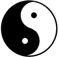
Lastly, I really enjoy this logo because it's simple, just like the rest that I chose. I really like how the crescents  fit in with one another and create a simplistic shape, and also the cool color scheme.

Symbols and Logos


   First off, symbols are usually pictures that don't use any words and occasionally a few letters to get an idea or thought across to the viewer quickly and easily. Symbols doesn't represent a company or association, but rather a simple message like: do not enter; you'll probably get yourself in a pickle if you do, 3.14159265389793238462 ect, or hey this will probably hurt you, so don't touch it.


Logos are similar to symbols in the sense that they tend to avoid words and sometimes letter, but logos are used very differently and in many different situations.  They tend to represent an organization or company and cannot be used by anybody else like: a major coffee chain, a worldwide event, or an international fast food chain.


Logo.With Artwork.

I think i did really well. Of course there will be things on my head about the whole thing but in general i think it looks good. Much better then the prototype for sure. Was a fun experience learning how to make a logo.

Tuesday, October 30, 2012

Logo Inspiration - Jacob Kiester


Logos
Firefox Logo - I really like this logo because it has a very clean design and really represents its product.  It is easy to see that this logo is representing Firefox because of the fox that looks like its on fire. 

Playstation Logo - I like the Playstation logo because it is one I have seen almost my whole life.  It looks really well done and is a very simple design.  I uses two initials to show that it represents the Playstation.

Skullcandy Logo - I really enjoy the skullcandy logo because of its artistic style.  The skull that the artist


In my mind symbols unlike logos represent universal ideas and are usually known by everyone, while logos are not as well known and represent a company, a person, a corporation, or an organization.


 The internet defines logos  as- A thing that represents somthing else

NickSanford Logo.


Halie: Inspiration


My Concept Map(Jesus)


Friday, October 26, 2012

Feedback

I need some feedback. When you comment please give me your interpretation of what this piece means, be descriptive! I feel like i need to add to it to convey my message better and im not sure how to finish the piece. Thanks!

Insipiration Logo

I thought this was a cool logo just because it mixes the lion and the lamb together in one picture, even though they are  two completely different animals. Two ideas into one logo that blends in well is pretty decent.

I like this logo because the S is encrypted into the cube like structure which gives it  a 3D effect.  Even though it is drawn/done in a 2D perspective, it feels as if the cube is eye popping.

I like this logo because you can tell it is a camera, but the C,S, and the F are all fused together to make the camera but also has the company name in it as well. 

Thursday, October 25, 2012

culture art

what do you think this means?

Sketches (3 out of 9 pages Scanned)

The circled pictures are the ones that I have selected for my "project," but the program for the scanner in the library is messed up and needs to be reinstalled. I have done more drawings than just these, but I can't scan the rest of them now. I will, however, find an alternative for finding a source for scanning the images.

Concept Map


Inspiration


I like the simplicity of these logos, there is not a lot going on in these which i think makes them better all around. I like how the font is simple and not over complicated, while it goes along well with the actual logo.

Wednesday, October 24, 2012

Painting so far

Need to add the megaphone, figure out the background, and fix/add a few little details. Likin' it so far
fingers crossed I don't mess it up! SR

Culture Painting Finished...I hope...

Decided not to add much more to it because I think it's more impacting without all the other things I had in it they just made it to unbalanced and busy.