The fish assignment is Due Feb 8. I'm expecting to see your fish completely sculpted, painted and textured in Mudbox. This includes importing the teeth and eyes with their own UV's. Finally you will create a turntable render using the Youtube HQ wide format and setting the number of frames to 240 and frames per second to 30. The exported format will be MPEG-4 which you can post to blogger.
Mr. E
If you don't feel that you will be able to accomplish this assignment by the due date, I highly encourage you to come over lunch.
Here is an example of what I expect to see.

Monday, January 31, 2011

Wednesday, January 26, 2011
Player Joe
This illustration was created to show the fiction side characters. The lighting is this determines a dark mood.
The illustrator uses lighting in a very unique way. The lighting from the light saber accents the tattoo that he has on his chest
I really like this drawing because he made a connection to Star wars and I love star wars. It is also very dark and mysterious, taking place on some foreign planet because the moon is visible. The person in this picture is also obviously an alien or some sort of out side human. The fact that he is in space with out a suit or helmet on makes us believe that he is not human.
I like the way he incorporated the light saber from one movie and a fictional alien. He also made the character kinda tribal with his tattoos and packs.
Numioh
This picture is of some sort of alien demon that has spiky armor. It appears there are four arms, two tucked away behind his back. I love Red Bull. The color of this creature’s skin is red which symbolizes war and anger. He has a bone spike tail with eight protruding
spikes along the sides of the tail.
His weapon of choice is some bladed brass knuckles. This creature obviously lives on some foreign planet, which has been recently destroyed. Ashes and burning embers are in the background surrounded by smoke and debris.
Tuesday, January 25, 2011
***Fish Assignment Due Jan 31***
The fish assignment is Due Jan 31. I'm expecting see the fish to be completely sculpted in Mudbox, textures painted and rendered in Maya using a displacement map. This rendered image will then be posted on the Blog for your grade.
Mr. E
If you don't feel that you will be able to accomplish this assignment by the due date, I highly encourage you to come over lunch.
Mr. E
If you don't feel that you will be able to accomplish this assignment by the due date, I highly encourage you to come over lunch.
Monday, January 24, 2011
Alanna Crandall

Artist Critique #2
To begin describing this picture, I can tell you that there are a lot and I mean A LOT of snacks/junk food, laying around in a spread out mess. Amongst the midst of all that, there is a heavier set woman lying on top of the snacks. She is wearing an American flag bikini, a pink headband, designer sunglasses, and Coco Chanel high heels. On top of her belly roll and larger thighs, are some of the foods, just chilling. Also, in her left hand, she is holding one of the candy bars. This woman has her head slightly turned to the right, her arms spread out and it looks like to me that she has her balance shifted on her left hip. If you were to look closely at the background, meaning the junk food the fat girl is lying on, then you would notice that the packaging are of different colors. And if you were to take a closer look, then you would see that the colors are separated by their colors. And then if you were to try to figure out the pattern with the packages’ colors, you would realize that the pattern is very much like that of an American flag. The blue, green, and purple packaged foods are in the upper left hand corner and are in the shape of a square. Starting from the middle and then stretching to the upper left corner, the white and red stripes of the American flag are formed. That stripe effect will continue down the rest of the picture and will also be resembled on the other side underneath the bluish, purple square.
Henrich Kimerling created this picture, titled American Beauty. He is an artist from Slovakia. He said that the film American Beauty inspired this image. I have never seen that film; however, I believe that Henrich is trying to show the obesity in America through this picture. The title of this piece speaks to me. Because if you were to think about it, several people believe that if someone is fat, then they cannot be beautiful. To most people, obesity is vulgar so they tend to shun those who have the unfortunate pleasure of being overweight. In another sense, this picture can be talking about how fatter people need to have more self-confidence in themselves. The junk in the background is representing what the world’s food industries have become nowadays. America would be the worst at producing junk food or unhealthy snacks. That would be why that America is the most obese country in the world, which I find pathetic and saddening.
Overall, this is a great picture to represent the health issues in America. I like the message the artist displayed in the picture, and the quality is fantastic too. I don’t think I would change anything about this image. It has a lot of imagery and speaks for itself. So that would mean that I don’t have to speak anymore myself. Haha.
Here is the link to the website: http://forums.cgsociety.org/showthread.php?f=121&t=701270
Friday, January 21, 2011
Artist Discovery 2


Oleg Zhukov, ANTS
Artist Oleg Zhukov is a photographer. In this picture you see up close an ant climbing out of what looks like a canyon to him but is simply a little crack. He blurs almost every thing but the ant, and what seems to be a pathway. In his following pictures he shows every step the ant take before he takes it. I like how he blurs out the surroundings except for the path the ant eventually travels. ITS really mysterious because you don’t know what the ant is doing. What is he doing, where is he going. I don’t like how nothing happens at the end. Its like it isn’t finished, but it keeps the mystery in.
Max Kostenko, Volkswagen Insects
Artist Max Kostenko is a cartoon designer. In this picture, The Volkswagen Insects, he has created six ‘Disney’ looking insects that have hit a cars window and are stuck their. He used an assortment of shapes and colors creating each insect. He was creating Disney looking insects to be used in a car company’s upcoming campaign. I don’t like how they all are on the window I tjink it would be cool if one of the insects were about to hit the window and had a different expression. I like how they all had different expressions and were spread out, also the insects are pretty funny.
Artist Discovery 1

http://features.cgsociety.org/story_custom.php?story_id=4960&page=2


The artist is Dave E. Phillips. His picture is showing a typical, but different look to a fairytale. You have little red riding hood standing upon a stump, and the big bad wolf. I don’t think the artist was really trying to accomplish anything besides trying to recreate an iconic story, but adding his own style to it, his own views on the story maybe. The title of this is "Unto an evil counsellor, close heart and ear and eye." This is taken from a short type poem called "The Spider and the Fly." In that story it's lesson is saying how one shouldn't stand around being idle, but on guard and wary. Which is vaguely what's being shown in his picture. I just really like this piece, it’s kind of incomplete, but really isn’t at the same time and I like that it’s not a full picture. It reminds me of how some stories suddenly end, a cliffhanger. Again, the only thing I don’t really like is the use of darker colours but it really fits the scene, and may be used to foreshadow an event if the story was told in picture.
Artist Discovery: 1.

The artist of this picture is Tim Lee. His picture shows a seemingly country man playing his banjo among a field and a crow with his house, like him, is floating, looking a bit wrecked, as is the barbwire fence. I’m actually not sure what the artist was trying to accomplish here. I think maybe he was trying to show one of many ‘country’ stereotypes, but presenting it in a bit of a surreal way. I really like the style of the artist and the drawing. However, I don’t quite like the dark colours that are used, setting a bit of a depressing mood which is almost in a way ironic in this piece, but nonetheless, very good.
Artistic Discovery 2

Artistic Discovery 2
Robert Butkovic made a series called; “100 logos in 100 days” and I am focusing on a photography logo that he made. The logo is based off of an AC/DC album cover and I think that it is really cool. The logo is using a warm and simple color palette with a burnt orange and black color. The logo has a camera on wheels to make it look like a cannon with a fuse in front of it. The phrase on the logo is, “For those about to shoot”. The logo is not very busy because it is a logo and your eye follows the fuse down to the lettering. I really like the simplicity used to create this logo and the colors that it uses. I couldn’t find anything that I didn’t like about this logo. Butkovic’s Logos are on this link http://www.behance.net/gallery/100-logos-in-100-days/807632.
Artistic Discovery 1

Artistic Discovery #1
Thursday, January 20, 2011
Artist Discovery 2
 This artist is Ray Frenden. The reason i picked this his art because he uses alot of colors and his art is really really cool he has such a awesome vision and it really shows in his art work. in this work you can see that he used alot of warm colors and it has a sort of humor in this artwork. i love the retro look of the painting and just the way it is laid out on the paper.
Crow No! by Ray Frenden

Wednesday, January 19, 2011
Artist Discovery 2


I like this artwork because, it is just cool! I would love to learn how to do this! The colors and effect of the black background is amazing. I wish they had of these types of photos then the random colored wispy water in the album (check the link.). Other wise I have no complaints, I think it is very awesome and beautiful. I think the artist was attempting to create a mushroom cloud type shape with the materials in the water. The artist accomplished this, by what I could gather, by putting paint or some other material in a water tank a certain way and taking pictures of how it went thought the water.
Picture link: http://www.behance.net/gallery/Aqueous-II-The-Sequel/678825
Tuesday, January 18, 2011
Alanna Crandall

Artist Critique #1
This piece of artwork almost looks like it is three-dimensional because of the lighting displayed, but in reality, this is only two-dimensional. This image has a cartoon style, if you were to ask me. The name of the piece is Playtime by Salvador Ramírez. He created this cute and cuddly picture in Photoshop. Given the quality and real-like effect of this picture, and that it was mastered in Photoshop, I would come to the conclusion that this man is very talented at what he does.
In this picture, there are three kids and a dog circled together. They are looking down at the ground, like there is a camera taking their picture from below. The sun is shining above them, through the middle of the jumbled circle they made. Each child has a different expression upon his or her face. In the background, you are able to see trees with greenish, yellowish hue leaves and possibly cotton (white splotches on the trees). In the left hand corner you can see some wooden object, which appears to be a tree house, and I’m pretty sure that’s what that is.
I believe that in this image, the artist was trying to portray the innocent fun that children have. Like how great childhood days could be because as a kid, you didn’t have a care in the world. Along with that, the goofiness of most kids is represented as well. Another concept the artist could be trying to depict in this case is the early stages of friendship.
I like this picture for the most part because the children shown are so gosh darn cute. I smile when I look at this picture. I like the children’s outfits, their faces, and the dog adds a good spunk to the picture’s ‘being.’ I like the style the artist has going on also. If I had this talent and creativity, then I would make something like this. I can’t seem to find anything I don’t like about this picture. I think since this photo is so gosh darn cute, no one can hate on it.
Here is the site where I found this picture: http://forums.cgsociety.org/showthread.php?t=937537
Artist Discovery 1

This artist is Drake Brodahl. The reason i like this art work so much is because it reminds me of my childhood cartoons i used to watch and he uses just awesome colors to me. Another reason is because he shows some humor in his work and I like the way he uses the color to express the mood of the art piece.
http://drakebrodahl.com/paintings2.htm
"Hitching a ride"
Friday, January 14, 2011
artist discovery

The artist that I found was Sharad Haksar. I really like his work because the stuff that he does actually means something and sends a message to the viewers. Some of his work has to do with drinking and driving and smoking and things like that, which I find really important. All of Sharad’s work is very interesting and nothing is boring. There isn’t anything I don’t like. The thing I love about this picture is the irony. I think the artist has a sense of humor which is nice
Artistic Discovery JKP

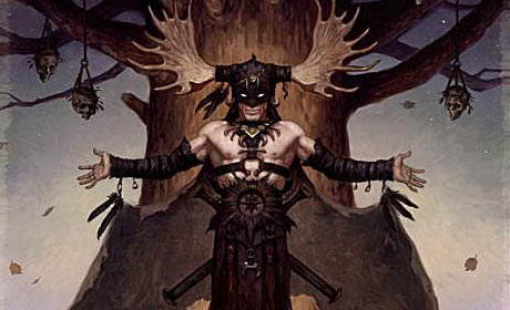
 These are just a few of the artist Brom's pictures, If you don't know the picture with the evil skull was used as the cover of the PC video game Diablo II. I like his work because I like the dark creepy feel you get from his pictures... when I was little one of his Evil toy monster things would always freak me out. What I think the artist was trying to accomplish the feeling of a dark place or world. Theres not much I dom't like about his art, except maybe the more "dirty" parts.(I don't mean hes making really sick stuff but not all of it is "clean"). All Images found of google image search of 'BROM'.
"Stronghold"

The title of this piece is, “Stronghold.” It was created in photoshop by Dmitry Dubinsky.
The focal point of this piece would be the Space hanger in the middle of the picture. This clearly takes place in the future on a foreign planet in what looks to be a desolate wasteland. The artist’s primary colors are browns, oranges and blues.
I believe that Dmitry was trying to create either an alien and/or futuristic space hanger on another planet. What I like about this picture is that it is on another planet, maybe even in another galaxy. I don't like the red's and brown's on the surface of the planet.
http://forums.cgsociety.org/showthread.php?f=137&t=904158

James Gurney created several pieces of artwork and books. In many pieces Gurney paired realistic illustrations of dinosaur with people, Like in his book Dinotopia. In this picture called a Song in the Garden I would have to say eth focal point would begin at the dinosaur itself. More particularly its head then perhaps its feet with the flower circlets, to the children playing music and then the plants and statues. I would also that the artist is trying to unify children’s curiosity of dinosaurs with themselves in a playful carefree way. What I don’t like is that there is only one butterfly and no other insects in this lush garden scene.
More on Gurney and his work at: ttp://jamesgurney.com/illustration.html

Eric Joyner
http://www.ericjoyner.com/
Eric Joyner specialized in robots and donuts. In this piece the focal point is the donut that leads down the pole to the patriotic image of the robots setting it up. Then from there it goes to the foreground and background. I can’t really find a piece that I don’t like or think it needs. It’s just as close to perfect as something can get to me. Also it is hard to say but I think the artist is trying to accomplish a childish world because nearly all his pieces (including this one) are of toy robots and or donuts, Godzilla or Santa. He is just keeping the spirit of the child alive inside of him.
Subscribe to:
Posts (Atom)