How
Symbolism Works:
Symbolism
is using words or images to represent a person, place, object, or idea. It can compare two like or unlike
things, using color, shapes, and other elements to give them both meaning. For
example, a red rose could represent love.
How Logos
Work:
A Logo is a
visual piece of artwork that represents or symbolizes a person, place, thing,
or idea. It is the face of a
business or person. It gives
people a feel of what your company is or stands for.
The
Difference Between Symbolism and Logos:
The Logo is
a clear mark of something. It can
contain names and art, Symbols are what gives things meaning. For example, a red rose could represent
love, while a yellow rose could represent joy or happiness. The different colors and shapes give
things a symbolic meaning. Logos and Symbols go hand in hand because, symbols
can be incorporated into the logos.
For example, the Nike swoosh is a logo, but it’s a symbol of a Greek
goddess’s wing, and the name Nike is the name of the Greek goddess of
victory.
The
Learning Process of the Logo:
It is
important to learn the value of a logo incase we ever want to start our own
business or go further in graphic designing. It makes us think about what the
logo really means. What the colors
and shapes represent, and it makes us further appreciate the meaning of a logo.
Eat
innovations is a food place in Newport Beach. The logo is really amazing, because the negative space plays
with your mind, and you eventually see the spoons and other shapes.
Sherwin
Williams is obviously a paint company, but I think there logo is really
cool. Thier motto is cover the
earth, and they take the colors from all over the world and turn it into paint.
Everyone
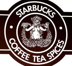
knows Starbucks by their logo, but behind their logo is a lot of
conspiracy. The lady is a
two-tailed siren. Before the
company made it big, you could see a lot more of her body. They eventually covered her body more
and changed the whole look of the logo.
I like this logo because it makes you curious about what the lady is or
why they chose this logo.


No comments:
Post a Comment