

Tuesday, September 10, 2013

Computer Assisted Art Semester One Independent Project
The vision that both Cory and I are attempting is a panoramic view of several animals, fitted with both weapons and armor. The animals in this project consist of a wolf, boar, bear, eagle, and a tiger. I am going to design the animals and model them in maya, while Cory is going to design the weapons and armor. He is also going to be adding the paint and fine touches to everything in mudbox. After everything is complete we will have a camera in maya rotate around the animals.
The vision that both Cory and I are attempting is a panoramic view of several animals, fitted with both weapons and armor. The animals in this project consist of a wolf, boar, bear, eagle, and a tiger. I am going to design the animals and model them in maya, while Cory is going to design the weapons and armor. He is also going to be adding the paint and fine touches to everything in mudbox. After everything is complete we will have a camera in maya rotate around the animals.
Logo(Marcos)

Logo


Monday, September 9, 2013
Logo name design

The reason for I chose the colors and characters for my logo are these reasons. The T in my name represents the different phases of emotions that people go through in life, such feeling happy, angry, sad, surprised etc. I really meant for it to look like a T from the anime Trigun, but it turned out differently than I expected. The A. The a is in the font of a game called Slender, where the text on the pages is in chicken scratches and looks like a child's work. Reason I chose this is because it represents my creativity. The Slender man, also the "I" in my name, represents that sometimes I act invisible and stray from other crowds, but unlike Slender man, I don't have long tentacles and can't teleport (which would be cool.)
logo

The reason i chose the style i did, is i really like the whole modern and simple look to my logo, something very black and chic. I added the gradation to my logo this year because i feel like it is more aesthetically pleasing vs the straight black. The font was slightly changed, it just looks very simple, yet all of the letters have this very straight concept to them. The two lines in the middle make up my initials "J" and "S", They do look good intertwined the way they are.
Logos designs and the chosen one

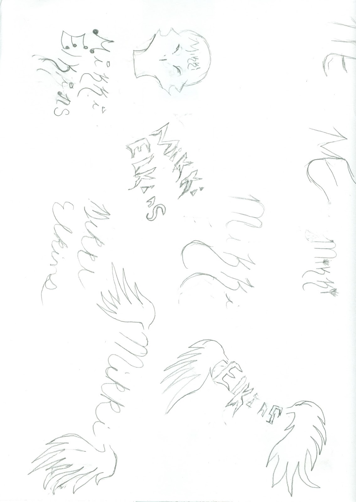
I chose the design that had wings and my name because it represents who I am. The wings represent all the hardship that helped me become who I am today. A song once said that sometime you got to fall before you can fly, so the wings are mine, each hardship has taught me that I can fall, but it can make me fly in the long shot. The color of the wings are purple because thats my favorite color, the name is black because its my comfort color. you don't seem me without the color black on.
My logo

2 or so things i forgot to post
Symbolism in my own words means the thing that everyone
cannot always see and sometimes start to believe.
Logos are a means of communication as well as an
advertisement sometimes they find peoples lost loved ones or pets and they also
put a little more color into everyone’s life with their simplicity.
The difference between the two are that symbolic images we
don’t use to advertise as well as the other things a logo does whereas the
logosare just advertisements for businesses and many more things.
The value of learning to draw logos and create them as well
is that us the children might become one of the most successful people that
there is the possibilities are endless
just because of this one class!
Friday, September 6, 2013
Final Logo
 This is my Final logo, its the logo of borderlands one of my favorite games customized to my initials M.V. Since I am a gamer this logo describes me pretty good.


logo design

Logo design.


JA Finished Logo



Subscribe to:
Posts (Atom)