***COMPUTER ARTs FINAL***

1. Wipe keyboards and computer screens

2. Clean room - trash

3. Backup your work to Dropbox.com

4. Turn in final assignment


Goals and Reflections

Goals

Write a short statement that describes what you plan to accomplish by the end of the week on your project.

Reflections

What did you accomplish this week (post your work, inspiration or research)?

What did you learn?

What is your next objective to be completed?

Friday, September 6, 2013

JA Finished Logo

I used sharp corners and red edges to catch the attention of the viewer, but added white rounded shapes to be less intensifying and more relaxed. This logo represents my initials in a cool way.


Here are my concept drawings and sketches.

Logo Sketches

So I just took my name and applied to a couple different fonts that I liked from dafont.com. I am pretty sure that my final logo will come from the spiky looking "HM" in the top-right.

Alex's concept map


3 logos

I like this picture because i like monkeys and sports

I like this picture because i like to read some comics

I like this picture because i watch MMA

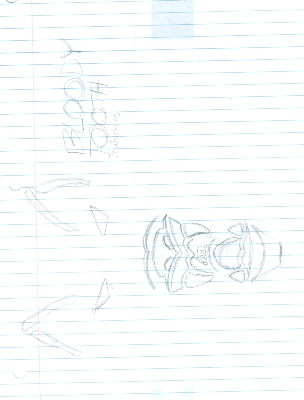
Here is the final product of my first two weeks. This logo doesn't just represent me. It represents my three closest friends. We work together, do everything together, and we are a pack. Tho blood moon came from the day that the red moon appeared in the night sky.

Finalized Logo

I feel like my finished logo represents the kind of art that I love to create. I primarily design characters, so I have a little person up there. For a long time I've liked to wear hoodies, so I added one onto the design and put the artist signature I've been using for years on the sleeves. Red is my favorite color.

Thursday, September 5, 2013

Bion's finished logo

I choose this as my logo because it is plain and simple. The font is somewhat plain and simple. But the logo is saying I am plain and simple, but the font will say that I am plain and simple sometimes. The colors of my logo are random. If I did do the colors I wanted it would be a black and gold or black and red look to it.

My Logo.

After I graduate from Full Sail University I plan to open my own company. So this is the logo I made for it.


I chose a wolf for my logo because I wanted to touch back to my heritage from the Cherokee Wolf tribe. I wanted it to have more of a Dark sense to it so I made the background gradients become darker towards the center. The center Gradients go from dark to light and back to dark for an Orb effect. Vanitas in Latin means Empty. This is why the things in my logo are the way the are.


Marek's Logo


Logo

I went this logo design because my artistic style is largely ink based. I enjoy ink art for more than other any other medium of art. I went with the quill because it is one of my favorite ink pen types. I have many different pen and quill sets at my house, and I made this one purple, seeing as it is on of my favorite colors. I think the combination of my initials (S and J), along with the Quill, and the dripping ink, really portrays my artistic style and how much I enjoy it.

My Logo


I choose this as my logo because I like video games and video gaming so i choose a digital video game feel for my logo. I choose this font for a similar reason because it is pixilized it goes with my video gaming theme.


Wednesday, September 4, 2013

This loge represents toxic gaming. This represent very well as you see the gas mask with the biohazard sign on it.                                      


This logo represents precision gaming. This logo represents well with the sniper in it because snipers have great precision.


This logo represents pure gaming. This logo also represents well because the logo is water and water is pure.

Billy's concept map


10 Sketches


logo feedback


Concept Map(Marcos)

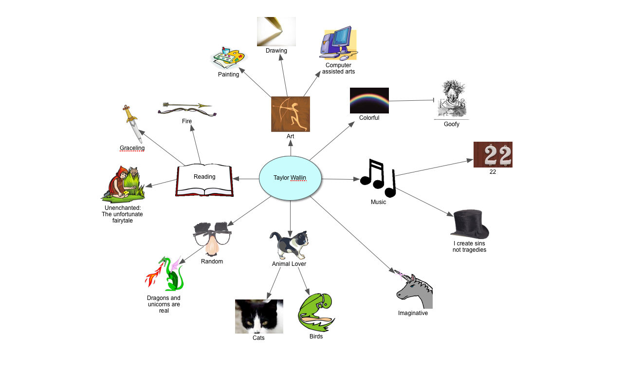
Taylors Concept map